Product
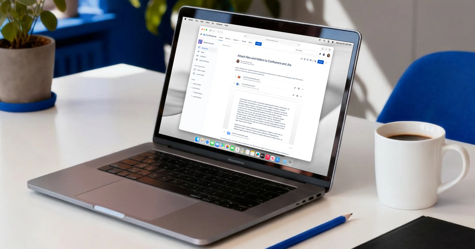
Team Files connects Jira and Confluence to cloud storage providers like Dropbox and SharePoint, so teams can attach and edit files without creating endless duplicates. Instead of downloading, editing locally, and re-uploading new versions, users link files and folders directly from their cloud drives and open them in a click. Updates happen in the original storage, so everyone sees the latest version.
A normal Confluence attachment shows as a small static thumbnail, frozen at the moment it was uploaded and impossible to edit without downloading it first. Team Files replaces that with a full preview inline, one click away from edit mode, and the preview keeps updating as the file changes, whether that happens in Team Files or back in the original storage.
Company
Team Files is made by ikuTeam and sold on the Atlassian Marketplace. It grew out of a previous startup I co-founded: TOPDOX, a mobile, single-user document tool that never found a sustainable business, but surfaced a clearer opportunity. Individual users valued what we had built but wouldn’t pay for it, while companies would. We carried that one idea forward, helping teams with the work around their documents, and it became ikuTeam, bootstrapped with no external funding.
Role
I was one of three founders and the only one working as a designer from 2018 to 2025, though not the only one who thought like one: our product owner, another co-founder, had a design background and pushed back on my work when it needed it. During that time, our team grew to seven people. I handled UX and UI, branding, communication, UX writing, and later, product documentation. I shaped the product from initial flows and visual identity to the design system, handoff, and ongoing improvements.
Problem and context
Team Files is for knowledge workers in Jira and Confluence, including software teams, support, marketing, operations, and others. The main problem was clear: once someone attached a document to an issue or page, collaboration became a cycle of downloading, editing, and re-uploading, leading to duplicates and version confusion.
Teams were wasting time, cluttering Jira and Confluence with copies, and often losing track of which file was “the latest.” Cloud storage providers already solved collaboration, but the integration with Atlassian tools was weak. Our goal was to bring cloud files into Jira and Confluence in a way that respected how these teams actually worked: one source of truth, one-click access, and no extra friction.
Strategy
From the start, our strategy was to do more than just let users paste a link. We aimed to build a deeper integration between Atlassian and cloud drives: connecting storage accounts and folders to specific projects, attaching files directly to issues and pages, and enabling one-click edit while keeping files in their original storage. Above all, we wanted the product to feel like a native extension of Jira and Confluence, visually and behaviorally.
As the product matured and the main flows became stable, we shifted from just making it work to making it smooth. The clearest example of that shift was a full UX review in 2023. By then the question wasn’t only whether people would try Team Files, but whether trials turned into paying customers and whether those customers stayed. I went through the product against Nielsen Norman’s usability heuristics, wrote up a report, turned each finding into a user story in Jira, and worked through them sprint by sprint rather than treating the review as a one-time cleanup.
A few of those changes stuck with me. Some actions weren’t visible enough, so I added a dedicated preview button to the file options, since many people never realized they could open a full-screen preview. I also gave every file and folder action its own icon, so they could be scanned at a glance. We added contextual help, with each part of the app linking to the relevant documentation right where you needed it. And we rewrote error messages so each one guided the user toward a resolution, with no more “something went wrong” dead ends. It’s also when I started pulling more of Atlassian’s own design system into the product: metadata labels on files and folders got a size increase for legibility, and I revised colors across the board to meet its contrast requirements. Accessibility ran through all of it, as it did through every release, from clear system feedback to error tolerance. No single change was dramatic on its own. But work like this, alongside steady improvements to stability and usability, is the kind of thing that quietly compounds into a product people stay with.
Core UX challenges
The biggest challenge was always the core flow: attaching a file in a way that was more powerful than a simple link but still felt straightforward. First-time users had to connect a cloud account, connect a folder to a project, then select files to attach. Powerful, but complex, so over the years I redesigned this flow many times to simplify the steps and clarify the language. A small addition to that flow: a live preview showed how attachments would look on the page before you attached them.
One small redesign captures the approach. To connect a folder, users picked from their list of connected storages. But the same path ran even when no storage was connected yet, dropping users into an empty list. So I had “connect folder” take them straight to connecting a storage instead, then land them right back in the flow to select folders. One step less, and it tested well. The same screen also carried permissions settings, letting people define which teammates could access the attached folder and whether they had edit rights.
On its own this is a small thing. But the path to making Team Files better was built from moments like it, the kind of friction you only notice once you’ve watched enough people hit it over time. That noticing is something long tenure on a product buys you that a short engagement never can.
Support was one of the best places to do that noticing. For a while, a recurring ticket had users suddenly losing access to connected folders. Engineering kept making the code more resilient, and that helped, but every new ticket still meant piecing together what had happened. Was it a real error, or had someone disconnected the folder and connected it again? At the time, reconnecting could break the links to files already attached. So I raised it with our CTO and product owner, and designed a log for each connected folder, where admins could see its history and tell one case from the other. After it shipped, that kind of ticket became rare, and when one did come in, we had a clear record to work from instead of going in circles trying to reconstruct it.
Another turning point was dropping the separate Team Files sign-up that the app’s first version required. This was a real engineering achievement, but it removed an important moment to explain the product. Most users never chose to install Team Files; their admin did. Usually, the first they saw of it was a file someone had attached to an issue, which they could open right away or unlock by connecting their own cloud account, with no Team Files account needed. The ones who went looking for the app itself, through the Jira apps menu, landed in a file manager with nothing connected yet. So I moved the explaining into the product itself: empty states that guided users toward connecting their first folder, and a short tour of the file manager. The first-run empty state became the real onboarding, not a placeholder.
That call was strategic as much as design. It simplified access for everyone, especially the large share of users who only wanted to view attached files and previously had to create an account just to look. It also reinforced something for me: when you can’t control where someone enters a product, every default state has to teach.
Shared folders raised a different problem as customers grew. Team Files started with small teams, so sharing a folder was simple: when one person connected it, everyone else browsed it through that person’s cloud account. At larger companies, that stopped being enough. Admins raised it as a security risk, and it broke accountability, since edits to shared Word documents all appeared under the name of whoever had shared the folder.
Many small teams still wanted the simple version, so instead of replacing it, we let admins choose between simple sharing and requiring each person to sign in with their own cloud account. The design challenge was adding that step without making shared folders feel broken. I kept folders visible with a clear Authenticate action, let people reuse an account they had already connected, and made a failed attempt offer another account instead of a dead end. Over time, signing in with your own account became the default.
We also had to design for narrow spaces, especially in Jira views. Team Files isn’t a mobile app, but it carries many of the same constraints: tight panels, a wide range of screen sizes, and information that has to be prioritized so the most important things survive when space runs short. I planned layouts so the app stayed usable in a small side panel and a wide full-page view alike. In narrow views, attachments dropped secondary metadata first, and the file manager grouped its folder actions under a single button, giving the space to the files themselves while keeping every action one click away.
Design execution
Beyond the core connect-and-attach flows already described, I owned the full surface of the product over seven years:
- Search. I designed a search system for finding folders inside connected storage, working around the technical limits that always made search a hard problem in this product.
- Layout options. Layout modes and display options so teams could choose how files appeared, balancing density and readability.
- Automation and admin settings. The setup for automation flows, and later a review and overhaul of admin settings, with clearer configuration for admins managing multiple projects and storage connections.
Alongside the product work, I established the design system. It started as Team Files components extending the Atlassian Design System Figma library to speed up my own prototyping and keep the experience coherent across Jira, Confluence, and ikuTeam’s other apps. Over time it outgrew the design side: by the time I left, it had become something engineers were actively building from, with my role shifting from author to providing direction. A system that crosses from Figma into the codebase is the point where it stops being a designer’s artifact and starts being shared infrastructure. That shift also meant more time with developers on UI and UX questions, and more time making the case that consistency wasn’t polish but part of product quality.
I also improved my own process along the way. I moved from Sketch to Figma, and improved handoffs with interactive prototypes and detailed Jira tickets that doubled as the basis for user documentation. Part of that process has always been folding in new tools as they earned their place, from Grammarly supporting the steady volume of documentation, site copy, and articles I wrote, to language models helping with UX writing, ideation, and research. I kept an eye on where things were heading too, like Figma Make, which made it clear that prototypes would soon be built in tools like it. The tools kept changing; the habit of adopting them deliberately didn’t.
Constraints and collaboration
I defined the visual and brand guidelines for ikuTeam, but inside the product the brand stayed deliberately subtle. Team Files was meant to feel like a natural part of Jira and Confluence, with productivity and clarity taking priority over strong branding.
We faced real technical constraints. We bootstrapped the project and grew at a steady pace, which sometimes slowed progress but made it more thoughtful. Security needs and browser rules also shaped the user experience. For example, many users wanted to open files in new tabs, but browser security often prevented us from doing so. In those cases, we had to choose between a less-than-ideal interaction and no feature at all, so we carefully designed around those limits.
I worked closely with engineering from the start. Every flow proposal went to our CTO, the third co-founder, before it went into a spec: whether it was feasible, what the spec needed to cover, what could wait. That meant technical limits surfaced before build, not partway through it.
Beyond the product
My work didn’t stop at the product. If something had a visual or written side, I was usually the one doing it. I created the Atlassian Marketplace listings, including screenshots and demo videos, and I designed, wrote, and coded the marketing site. The site and the listing were also where I ran the most experiments: taglines, keywords, and call-to-action variants like “Get started (it’s free)” and “Free trial,” all aimed at getting people from the site to the Marketplace and into a trial. I produced the documentation, promotional materials, and the assets we brought to Atlassian events, including Team ’23 in Las Vegas and Unleash 2023 in Amsterdam, both of which I attended.
This wasn’t a separate job from designing the product. It was the same ownership extended across every surface where users and prospects met the work, from a Jira panel to a conference booth.
Impact and learnings
Team Files launched several years ago and is still actively maintained, used by over 9,000 companies and rated 3.7 out of 4 on the Atlassian Marketplace during my tenure. Churn tells the other half of the story. It was high in 2020 and came down year over year until it sat in line with the Atlassian Marketplace average. That was a team effort across engineering, support, documentation, and design, and I can’t pin it on any one change, but it’s the clearest sign that the steady work described above did what it was meant to. The core bet itself was confirmed by the people using it day to day:
“Team Files is the perfect way to connect the file-based world with Confluence. There are always documents that are created or received in file form. With Team Files, these don’t have to be uploaded to Confluence as attachments, but can be located in a cloud service and elegantly integrated into Confluence. For us, the app is a very helpful tool.”
Frank Leclerc, Decadis (Atlassian Marketplace review, 2023)
Key learnings:
- Growing a design system from individual screens into shared infrastructure that engineers built from directly
- Improving handoff with interactive prototypes and detailed Jira tickets that also supported better user documentation
- Acting as a consistent user and accessibility advocate in a small team, treating contrast, legibility, system feedback, and error tolerance as part of every release
- Combining user feedback and usage data to guide decisions and prioritize improvements
- Working as the only designer alongside a design-literate product owner and an engineering team, balancing strategic thinking with detailed craft over a long period
Most design work is measured in sprints. Team Files gave me something rarer: the same product and the same core problem to keep getting right, with a user base that grew year after year. That length changed how I designed. I could watch a decision age, see where my own past choices created friction, and fix them with the benefit of hindsight instead of guesswork. It also meant the work was never just one product. Keeping the experience coherent across Jira and Confluence, and across ikuTeam’s other apps like the Office Editor, was a constant background effort that doesn’t show up in any single screen. Owning one product that long taught me that the hard part isn’t shipping a good first version. It’s keeping it coherent while it grows.