Product
The Food Save app is a mobile tool designed to help professional kitchens reduce food waste with concrete, ready-to-use measures. Instead of abstract sustainability advice, it gives head chefs and kitchen managers a curated library of actions they can implement step by step. The focus is on practicality: busy teams quickly find measures that fit their context and integrate them into daily work.
Company
The app was developed at Foodways, a Swiss company focused on food sustainability, in collaboration with the “United Against Waste” foundation. Foodways works with industry and individual businesses to reduce food waste, and the app extended this work into a simple, accessible tool for gastronomy companies.
Role
I was the sole UX/UI designer from 2018 to 2019. I defined user flows, designed the interface, and prepared handoffs for development. I reported to Moritz and Mark on the Swiss Foodways team, who ran the project on behalf of United Against Waste, and collaborated with PM João Almeida in Lisbon.
Problem and context
Food waste is an environmental and ethical problem, and in a low-margin business like gastronomy, an economic one too. United Against Waste works with companies to fight it, and Foodways was commissioned to create a mobile tool that brings actionable measures directly to professional kitchens.
Kitchen managers knew they should reduce waste, but didn’t know how to do it practically. Busy schedules made environmental motivation insufficient on its own. What they needed were concrete, implementable ideas that fit their fast-paced reality.
Constraints: fixed UAW visual identity, external dev team across time zones, tight pre-approved budget. Designs had to be focused and realistic to build.
Research and insights
The primary users we designed for were head chefs and kitchen managers. They decided which measures to adopt and communicated them to their teams. The goal was not to put another app in everyone’s hands in the kitchen, but to support decision-makers with clear, usable guidance they could translate into procedures.
In interviews and informal conversations, a few patterns stood out:
- Many managers felt they were “probably wasting more than they should” but didn’t have a clear overview or plan;
- They were not interested in social features or competition; they cared about simple measures they could realistically introduce;
- Any solution had to be fast to consult and easy to revisit; they didn’t have the time or mental space for complex interfaces.
These conclusions reinforced the need for the app to focus on clarity and action, rather than gamified competition or social ranking.
Strategy and concept shift
Early on, the idea was to create a competition between kitchens, where teams would implement measures and publicly share their results. On paper, this sounded engaging. In practice, feedback from kitchen managers suggested the opposite: they did not see themselves using a competitive app or spending time publishing results. They wanted knowledge and concrete suggestions, not the social layer.
Given our limited budget, investing in social and competitive features would have meant less time and money for the core experience. I shared these insights with the Swiss team, and together we shifted the concept from a “food challenge” app to a Food Save app focused on:
- Providing a library of concrete waste-reducing measures;
- Helping managers choose measures that fit their reality;
- Supporting implementation with a simple, focused workflow.
It was a clearer, smaller product, and a better fit for what managers actually told us they wanted.
Design execution
Measure library
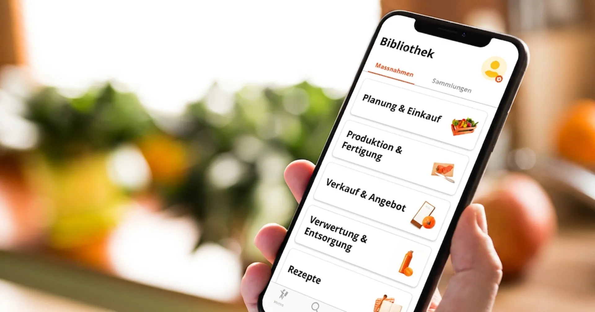
The Swiss team provided the content: a structured set of measures and categories grounded in their expertise and the Food Save methodology. My role was to design how this information would work on a phone and be navigated in a busy work context.
I created a measure library that followed familiar mobile patterns so it would feel natural on both iOS and Android from a single shared build. Users could browse by category and quickly see which measures might be relevant to their kitchen type. Each measure was presented in a compact, scannable way, focusing on what to do, how to do it, and, where relevant, extra details such as examples or recipe ideas to use up specific ingredients. Each measure could also be shared directly with a colleague, so an idea worth trying wasn’t stuck with whoever happened to find it first.
To-do list for implementation
Once we dropped the competition and social features, we had some development budget left. I proposed using it to support implementation directly with a checklist.
Instead of just reading measures and hoping to remember them, kitchen managers could:
- Select measures they wanted to implement;
- Store them in a simple to-do list inside the app;
- Mark them as completed once they had been introduced in the kitchen.
This small addition turned the app from a static library into a light planning tool. It fit the way managers work: they could collect ideas, prioritize them, and return when they had time to act.
Home
Home was the app’s entry point from the first release. It combined two kinds of content: measures suggested from what a manager had already completed, and collections the content team curated by hand for timely or seasonal ideas. It gave the app somewhere live to open to, instead of sending returning users straight back to a huge list of measures.
Branding and UI
I followed United Against Waste’s branding, as defined in the primary color, the presence of their logo, and the image style. Beyond that, the app’s visual system, including logo, layout, and detailed screen designs, was created by me, balancing consistency with clarity and readability across both platforms.
Collaboration and delivery
I worked asynchronously with the Swiss team (Moritz and Mark, on the United Against Waste side) and with João, the Lisbon PM, using annotated Sketch files and written specs for handoff.
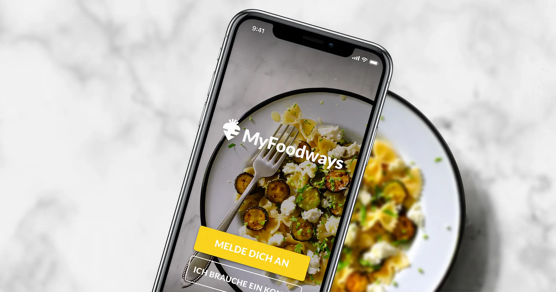
When João went on paternity leave, I covered the product work alongside my own. I sent the same brief to several studios to pressure-test our options. One made a strong case for native iOS and Android builds, and as a designer I wanted to push for it, since native usually gives the better feel: speed, system integration, the small things users notice. But the performance gain was too small to justify the cost and timeline, and a single shared build was the only way to ship on time and on budget. I brought my recommendation to the Swiss team and we decided together: Brief, the studio that had built MyFoodways, where our shared understanding of the Swiss and multi-platform requirements still made them the right fit.
The same user conversations that reshaped Food Save also pointed me to the implementation that kept the project within budget. I kept the developers moving, reported to stakeholders, and held my design work in parallel. It went well enough that the team asked me to see the project through to the end, which I did. It worked because João and I got on well, and because I put in the effort to keep everyone in the loop rather than treating the cover as someone else’s job.
Part of a pair
Food Save did not ship alone. Alongside it, I designed the Waste Tracker, a companion app where kitchen staff logged the weight of the food they threw out at the end of each day. Foodways promoted the two together: one app for ideas, the other for accountability. Food Save suggested measures to adopt; the Waste Tracker showed whether waste actually dropped after putting them in place.
Where Food Save and MyFoodways were text and image driven, the Waste Tracker was a data product, which made it a different design problem. The onboarding started off the screen: before logging anything, a kitchen set up one consistent container per category it chose to track and labeled each one clearly. We provided printable A4 labels that reused the app’s colors and icons so the link between bin and screen was obvious, though kitchens were free to label their own way as long as the categories were unmistakable. From there, staff entered weights on mobile and saw their own visualizations, while a connected web app gave managers the same views plus monthly reports. I owned the full flows, the data visualizations, and those physical labels, working within Foodways branding while pushing it where the context called for it.
Reto Mettler, Head of Catering at Jungfraubahnen, a development partner that tested the app from the start, described it as simple and intuitive, focused on the essentials:
“It shows what ends up in the trash and inspires you to do something about it. Fast, simple, effective.”
Reto Mettler, Head of Catering, Jungfraubahnen
That was exactly the point of making waste visible enough to act on.
Impact and reflections
The app launched and ran in real kitchens before being discontinued. Like a lot of commissioned sustainability work, its lifespan was tied to the program behind it rather than its own usage.
While it was live, the feedback confirmed the core bet. A bakery professional who used it, Jens Jung, put it plainly: the information and suggestions were “clear and easy to understand.” That was the whole aim, to turn a broad sustainability goal into steps a busy kitchen could grasp and act on.
UX design learnings
- User research reshapes concepts: Kitchen managers rejected competition, leading to a more practical product;
- Simple features have impact: The checklist turned a library into an actionable planning tool;
- Budget constraints improve focus: Limited resources forced prioritization of what really mattered to users;
- Cross-role flexibility: Covering product during the PM’s leave, from vendor selection to a native-versus-unified build decision, sharpened how I weigh design ideals against real constraints.