Product
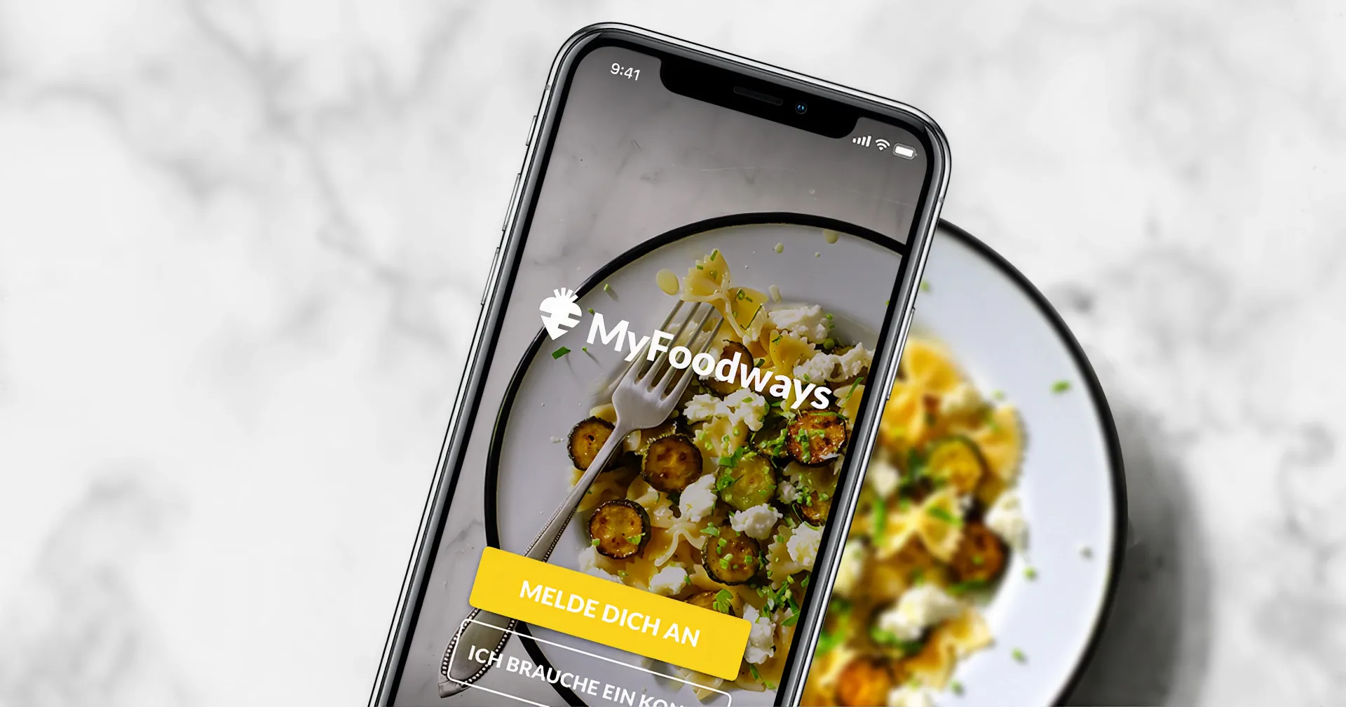
MyFoodways was a sustainable recipes app for iOS and Android designed to help people cook healthy, practical meals with the ingredients they already had in the fridge. The core scenario: it’s 7 PM on a weekday, fatigue sets in, and people default to familiar meals. MyFoodways suggested recipes based on what was on hand, removing the need for an extra trip to the store or tricky substitutions. The aim was to make sustainable cooking feel like a small choice in an everyday routine.
Company
Foodways is a Swiss company focused on food sustainability, partnering with the food industry and households to reduce waste and align with the UN Sustainable Development Goals for 2030. The app was created as both a public service and a behavior-change experiment.
Role
I was the sole UX/UI designer from March 2018 to December 2020, joining shortly before the first public release after the initial prototype and visual style were established. I handled user flows, interface design, and developer handoff, working closely with PM Laura Robinson in Switzerland, the local Foodways team, and the external engineering team in Lisbon.
Problem and context
Swiss authorities commissioned MyFoodways to help households reduce food waste with a mobile-first experience. The real challenge: people wanted to cook sustainably but faced decision fatigue at day’s end, and most recipes didn’t fit their lives. Hard-to-find ingredients, large portions, tricky substitutions. It’s a pattern still common in recipe apps today: rigid ingredient lists with no room to improvise, portions fixed regardless of who’s actually cooking.
From the start, we worked under tight constraints: a fixed visual identity from an external agency, with a pastel-heavy palette that predated any of the accessibility work, an outsourced dev team across time zones, and a hard public launch set for June of 2018. I joined in March, which left roughly three months to get the first release out. That runway shaped what shipped. We cut scope deliberately, holding back features like the recipe library for after launch, and kept adding recipes throughout the app’s first year live. Our goal was to make sustainable cooking a minor adjustment, not a lifestyle overhaul.
Research insights
User research and early focus groups confirmed the problem. People loved the sustainability mission but needed practicality.
Key findings:
- People wanted easy recipes using what was in their fridge right now;
- Portion scaling and ingredient swaps were essential for small households and flexible cooking;
- Sustainable options had to feel familiar, with small tweaks to everyday meals rather than radical changes.
These shaped the app: ingredient-led discovery first, flexible recipes second, lightweight planning third.
Solution strategy
When I joined, MyFoodways had a clear “fridge-first” vision and chef-curated recipes. What was needed were behavioral enablers: intuitive ingredient swapping and portion scaling.
My strategy:
- Ingredient-led discovery as the primary entry point (“What’s in your fridge?”);
- Flexible recipes that adapt to household size and available ingredients;
- Lightweight planning so users could save and reuse their sustainable go-to meals.
The approach embedded sustainability into routines, framing behavior change as user-driven and low-barrier. We avoided didactic messages and focused on tools that nudged choices in a sustainable direction.
Key features designed
1. Ingredient-focused search
Search started with “What’s in your fridge?” Users entered ingredients (spinach, feta, pesto) and received recipe combinations instantly. This gave immediate meal ideas without waste. Seasonal, quick-meal, and dietary filters narrowed options. Advanced filters stayed tucked away to avoid overwhelming beginners.
2. Profile personalization
Onboarding ran three short screens. The first asked about diet: whether the person eats meat, fish, and dairy, and how often. The second asked what they were here for, with three motivations to choose from: spend less time cooking, eat seasonally, or avoid food waste. The third asked about allergies.
All three answers fed the personalization tab, where they became settings the person could update as their needs changed, alongside household composition. The profile wasn’t a one-time setup. It was the place the app went back to every time it decided what to show. Diet and no-gos filtered the catalog, motivations shaped what got surfaced, and household composition set the default portion scale so recipes arrived sized for the right number of people.
No-gos did more than hide things. If a recipe used an ingredient someone avoided but a safe alternative existed, the recipe still appeared, with the alternative already swapped in rather than dropped from the results. Add soy to your no-gos and a recipe that called for it would quietly show up with something else in its place. The catalog stayed open instead of shrinking every time someone added a restriction. This is the automatic, profile-driven half of a swap system that also had a manual side inside each recipe, covered below.
That allergies screen is also where the first update after launch changed something small that mattered. Framing the question as allergies turned a cooking preference into a medical declaration. It felt heavier than it needed to be and didn’t fit people who simply disliked an ingredient or avoided it for reasons that had nothing to do with health. So we reworded it. The onboarding screen became “are there any ingredients you’d rather avoid,” and the setting became “My no-gos.” The softer framing covered a serious allergy and a personal dislike equally, without asking anyone to categorize themselves medically.
3. Flexible recipe flow
Every recipe loaded with smart defaults from the user’s profile:
- Portion scaling automatically adjusted to household size (for example “2 adults, 0 kids”) with instant recalculation, making cooking for the right number easier;
- Ingredient swaps appeared via yellow chevrons (spinach → chard → kale). Where the profile handled avoidance automatically, this was the manual, in-the-moment version: out of spinach tonight, tap to see what else works. The swaps still respected your no-gos, so the alternatives offered were always ones you could actually eat. It doubled as a confidence aid for less experienced cooks who don’t yet have the instinct for which substitutions hold up, so a missing ingredient stopped being a reason to abandon the recipe or make an extra trip to the store;
- “Let’s cook” generated final cooking steps with the reviewed ingredients and quantities, plus leftover suggestions and storage tips to encourage sustainable habits.
The “Let’s cook” button was a pragmatic MVP decision. Live, step-by-step cooking updates weren’t technically feasible for v1, so we consolidated everything into a single server call. This gave users one quick path from ingredient review to cooking.
4. Challenges (2020)
The last feature I worked on was a structured challenge to nudge habits over a set period. Rather than a self-serve menu, it ran as a cohort. Every user took it on at the same time, with an email and push notifications a few days ahead to build some anticipation.
The one that shipped was “Plant-based Rockstar,” a seven-day challenge built around small, doable tweaks to eat more vegetables and discover plant protein sources. Each day had a theme. Day three was lentils: work them into dinner, using either the app’s recipes or a companion post on the MyFoodways blog for more ideas. Completing a day’s task let you check it off, and the app would offer a prewritten message you could share with friends through WhatsApp or your messages app, a light invitation rather than a competition. Some days also included an offer from a partner.
I designed the full flow for this first challenge, with more planned to follow. The follow-ups were never greenlit, and the format was paused after the first run. I don’t have engagement data to point to, so I’ll only say what I know: one challenge shipped, the rest didn’t, and the idea didn’t become a recurring part of the app.
Accessibility over time
The visual identity arrived fixed from an external agency. The initial primary color was a soft pink, which had its own legibility problems, and user feedback pushed the team toward yellow instead. I got the revised brand guidelines when I joined the project and worked on the switch from the soft pink to the bright yellow that signaled most of the interactive elements.
Initially, the CTA buttons had regular white text over the primary color. I already suspected white on that particular yellow would be a stretch, so I made it bold and all-caps to improve legibility. At the same time, the recipe tags moved from filled color badges with white text to a dot next to dark text, easier to read and taking up less space. The tab bar’s selected state moved from the soft pink to dark gray before v1 shipped too, defensible both on the general look of iOS apps at the time and on contrast. Three small calls, one instinct.
None of that was enough for the buttons, though. Once live, bright yellow (#FAD21E) sat behind primary action buttons with white text on top, and white on that yellow scored 1.47:1. The AA threshold for large text is 3:1, so this wasn’t a borderline call. I flagged it and proposed alternatives, a darker toasted orange first, then other colors pulled straight from the brand guide. All were turned down. The palette was the agency’s to defend, and the yellow had just won a round on user feedback, so it wasn’t moving again. It stayed survivable for a while, only a handful of buttons, always saying the same thing, “Sign in” and “Let’s cook,” so people learned them by shape and position rather than reading them.
In the first real update after launch, I went through the app for legibility more broadly: section headers went from a light weight to properly dark, cards got more room to breathe, and the ingredient-swap indicator got a more prominent look to communicate it was interactive, among other smaller fixes. The bigger repeat of the same instinct was the Favourites screen: a segmented control became a familiar tab look, dark text signaling the selected tab like the app’s own tab bar, yellow reduced to reinforcement rather than the label’s fill.
The Challenges feature, in the last update, finally broke the standing workaround. Its buttons carried more text, and the text changed from screen to screen, so there was nothing fixed left to learn. Bad contrast on a predictable label is one thing. Bad contrast on a label you have to actually read every time is another. That gave me the case to push harder, this time on a new surface rather than against the locked core palette. I designed the challenge buttons as white with an emboss so they still read as tappable, used a warm gray (#5B5752) for the label, which cleared AA, and put the brand yellow to work as a state: a button filled yellow once you completed that day’s task. Yellow went from the thing hurting legibility to a signal that meant something.
It was a contained win. The new pattern applied to Challenges, while the original buttons kept their treatment. The lesson stuck anyway: the same accessible instinct showed up on its own, more than once, wherever I had room to act on it. Where I didn’t, I said so, flagged it early, mitigated what I could, and waited for the moment the argument would finally land.
Collaboration and delivery
I worked mostly asynchronously with PM Laura Robinson, switching to formal syncs for key milestones with the Lisbon team and developers. Autonomy continued even when Laura was away, supported by clear documentation.
Handoffs used annotated Sketch files and Laura’s written specs for amendments. We scoped pragmatically: “Let’s cook” was the simple solution, while “Favourites cookbook” was deferred until after launch. Post-launch changes, such as inclusive language, were driven by user feedback.
Impact and reflections
Impact
The app reached over 6,000 downloads in its first six months, around 40% of them in Switzerland. What stood out in user feedback was that people described the product back in the same terms we had designed around. One five-star review put it plainly:
“A great cookbook that lets you substitute ingredients in the recipe so you can use whatever you have in the fridge.”
The fridge-first premise and ingredient swapping, the two bets the whole experience rested on, were exactly what users named when they talked about why they liked it. Engagement decreased over time as sourcing chef content became unsustainable, and after public funding concluded the app transitioned to maintenance mode.
UX design learnings
- Inclusive language. “Food allergies” → “My no-gos” made profiles accessible beyond medical contexts;
- MVP pragmatism. A single “Let’s cook” button beat complex live updates;
- Accessibility advocacy. White-on-yellow buttons failed AA. I paired the yellow switch with bold, all-caps text from the start, anticipating the problem, but the color itself was locked, and I was overruled on every alternative I proposed. Where I had room to act, the same instinct kept resurfacing: the tab bar before launch, the Favourites screen after. When Challenges later introduced variable button text, I had the case to redesign the buttons entirely, white with a readable gray label, yellow repurposed as a completion state. A contained win on the core CTAs, since “Sign in” and “Let’s cook” kept their original treatment throughout;
- Reading a quiet result. I designed and shipped the first cohort challenge, “Plant-based Rockstar.” The planned follow-ups were paused and never built. Without hard data, I won’t claim it changed habits. Not every bet becomes a pillar, and being honest about which ones didn’t is part of the work.
Reflections
MyFoodways taught me that good design isn’t enough on its own. The app did what it set out to do, but sustainability work needs a business model behind it, and public funding left no room for one. When the money ran out, so did the chef-curated content the experience depended on. What stuck with me was everything around the screens: pushing on constraints I couldn’t always move, scoping honestly across time zones, and knowing how to read it when a bet didn’t land. I came out of it a more patient designer, and a more confident cook.