Product
MyFoodways was a sustainable recipes app for iOS and Android designed to help users create healthy, practical meals with ingredients they already had in their fridges. The core scenario: it’s 7 PM on a weekday, fatigue sets in, and users tend to default to familiar meals. MyFoodways efficiently recommended recipes based on available ingredients, minimizing the need for additional shopping or complex substitutions. This made sustainable cooking accessible for everyday routines.
Company
Foodways is a Swiss company focused on food sustainability, partnering with the food industry and households to reduce waste and align with the UN Sustainable Development Goals for 2030. The app was created as both a public service and a behavior-change experiment.
Role
I was the sole UX/UI designer from 2018 through 2020, joining after the initial prototype and visual style were established. I handled user flows, interface design, and developer handoff, working closely with PM Laura Robinson in Switzerland, the local Foodways team, and the external engineering team in Lisbon.
Problem & context
Swiss authorities commissioned MyFoodways to help households reduce food waste with a mobile-first experience. The real challenge: people wanted to cook sustainably but faced decision fatigue at day’s end and recipes that didn’t fit their lives, requiring hard-to-find ingredients, large portions, or tricky substitutions.
The problem: recipes that don’t fit real life
From the start, we faced tight constraints: a fixed visual identity from an external agency, an outsourced dev team across time zones, and a strict 2019 public launch deadline. Our goal was to make sustainable cooking a minor adjustment, not a lifestyle overhaul.
Research insights
User research and early focus groups confirmed the problem. People loved the sustainability mission but needed practicality.
Key findings:
● Users wanted easy recipes using what’s in their fridges right now.
● Portion scaling and ingredient swaps were essential for small households and flexible cooking.
● Sustainable options had to feel familiar, with small tweaks to everyday meals rather than radical changes.
● Users wanted easy recipes using what’s in their fridges right now.
● Portion scaling and ingredient swaps were essential for small households and flexible cooking.
● Sustainable options had to feel familiar, with small tweaks to everyday meals rather than radical changes.
These findings shaped the app: ingredient-led discovery first, flexible recipes second, and lightweight planning third.
Solution strategy
When I joined, MyFoodways had a clear “fridge-first” vision and chef-curated recipes. What was needed: behavioral enablers like intuitive ingredient swapping and portion scaling.
My strategy:
● Ingredient-led discovery as the primary entry point (“What’s in your fridge?”).
● Flexible recipes that adapt to household size and available ingredients.
● Lightweight planning so users could save and reuse their sustainable “go-to” meals.
● Ingredient-led discovery as the primary entry point (“What’s in your fridge?”).
● Flexible recipes that adapt to household size and available ingredients.
● Lightweight planning so users could save and reuse their sustainable “go-to” meals.
The approach embedded sustainability in routines, framing behavior change as user-driven and low-barrier. We avoided didactic messages and focused on empowering tools to shape choices toward sustainable actions.
Key features designed
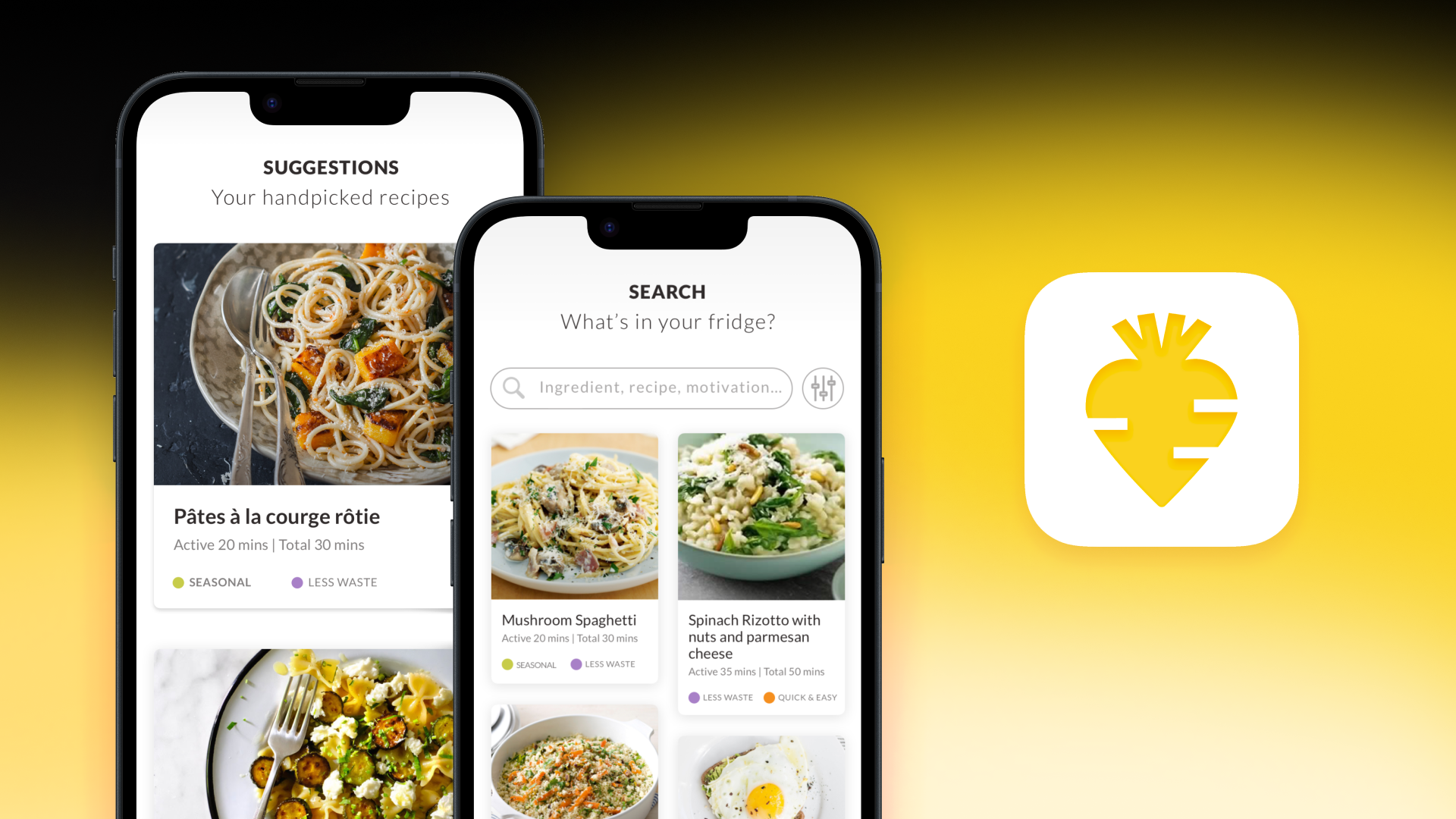
1. Ingredient-focused search
The search began with “What’s in your fridge?” Users entered ingredients (spinach, feta, pesto) and received recipe combinations instantly. This gave immediate meal ideas without waste. Seasonal, quick-meal, and dietary filters narrowed the options. Advanced filters stayed hidden to avoid overwhelming beginners.
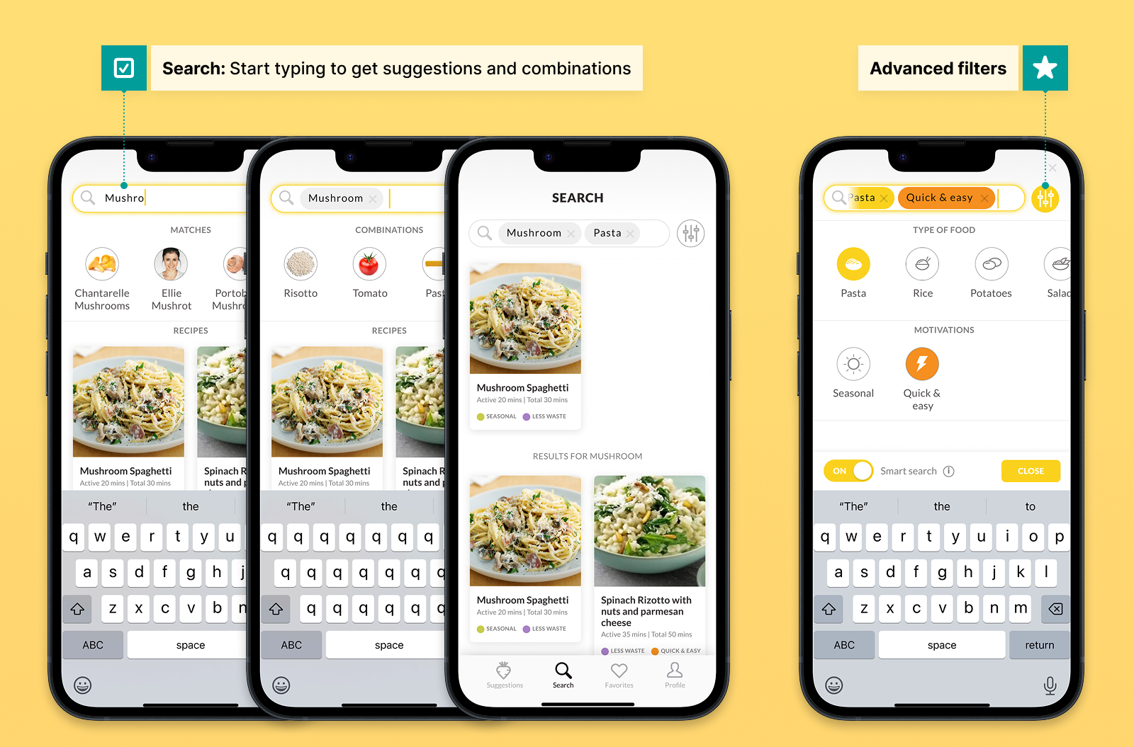
Quickly find recipes from fridge ingredients
2. Profile personalization
Onboarding captured dietary style, cooking motivations, and pantry staples, which were used to personalize search results, recommendations, and recipe defaults. This led to more relevant recipes and fewer irrelevant suggestions for users. The profile tab lets people manage “My no-gos”, a post-launch change from “food allergies.” User feedback showed “allergies” felt too medical and exclusive, while “My no-gos” worked for various reasons.
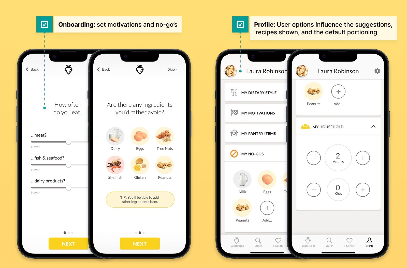
Personalization that actually works!
3. Flexible recipe flow
Every recipe is loaded with smart defaults from the user’s profile:
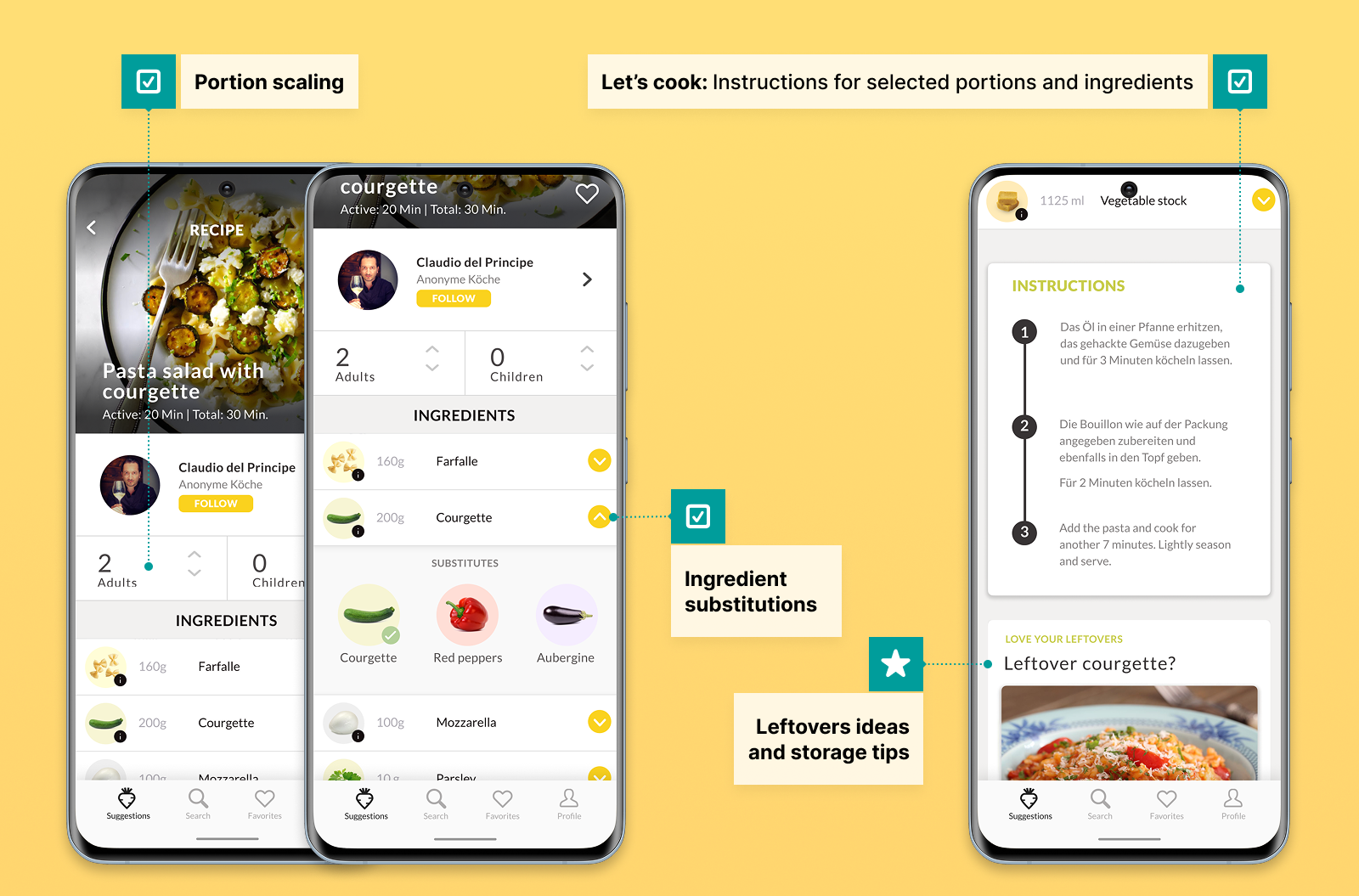
● Portion scaling automatically adjusted to household size (like “2 adults, 0 kids”) with instant recalculation, making cooking for the right number easier.
● Ingredient swaps appeared via yellow chevrons (spinach → chard → kale), always suggesting sustainable alternatives to reduce food waste and increase accessibility, ensuring more users could cook meals without extra shopping.
● “Let’s cook” generated final cooking steps with reviewed ingredients/quantities, plus leftover suggestions and storage tips to encourage sustainable habits. These tips gave users actionable ways to reduce waste after cooking.
Flexible recipes in action
The “Let’s cook” button was a pragmatic MVP decision. Live, step-by-step cooking updates weren’t technically feasible for v1, so we consolidated everything into a single server call. This approach gave users a seamless, quick path from ingredient review to cooking, saving time and reducing confusion, which led to faster meal preparation and higher user satisfaction.
4. Challenges feature (2020)
Post-launch, I designed progressive challenges to build habits: “No challenge” → pick one → daily check-in → simple celebration. As a result, users remained engaged, experimented with new sustainable recipes, and gradually integrated sustainable practices into their daily routines.
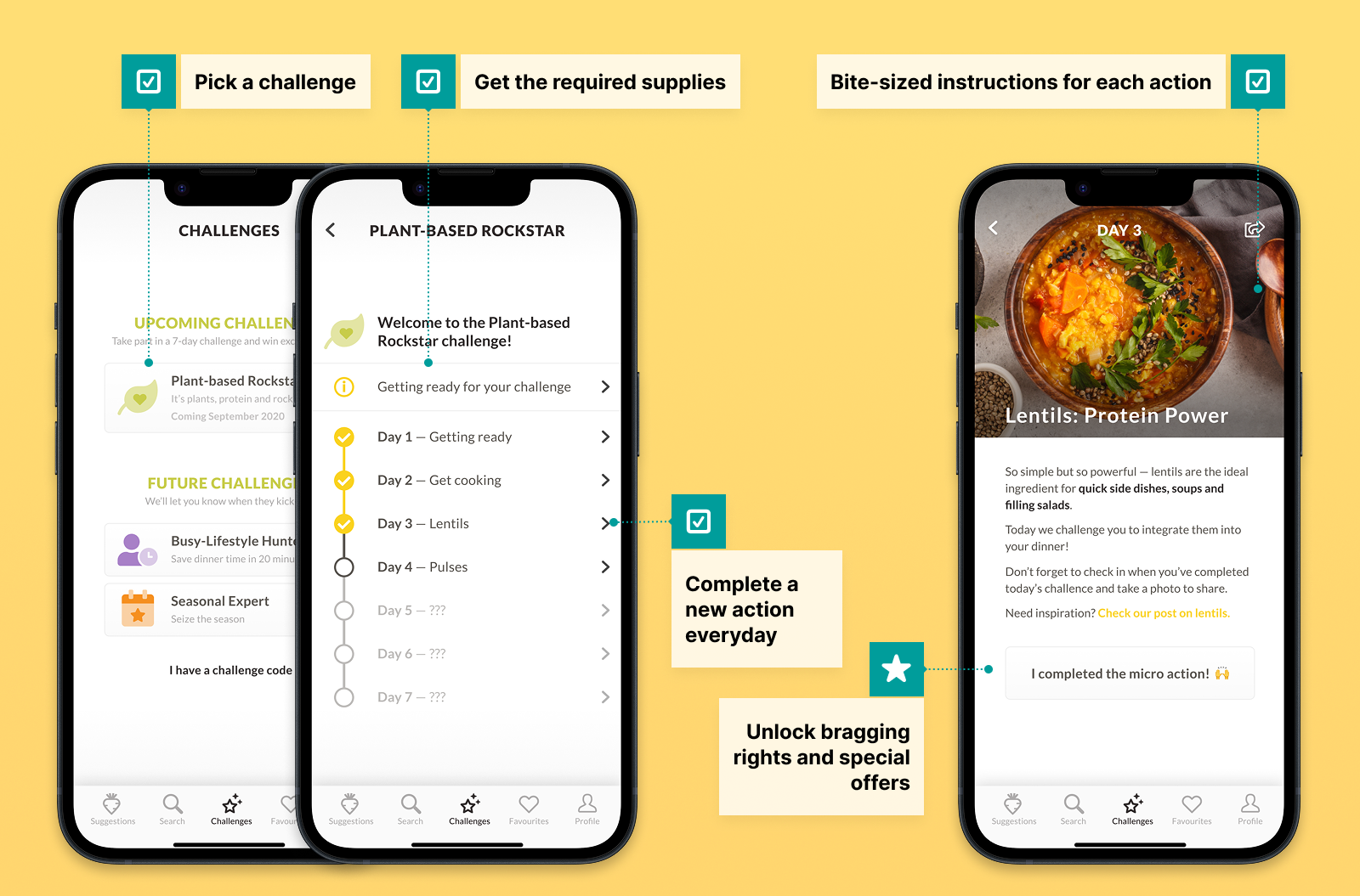
Progressive habits, not overwhelming asks
Collaboration & delivery
I worked mostly asynchronously with PM Laura Robinson, switching to formal syncs for key milestones with the Lisbon team and developers. Autonomy continued even when Laura was away, supported by clear documentation.
Handoffs used annotated Sketch files and Laura’s written specs for amendments. We scoped pragmatically: “Let’s cook” was the simple solution, while “favorites cookbook” was deferred until after launch. Post-launch changes, such as inclusive language, were driven by user feedback.
Impact & reflections
Impact
Established a strong Swiss user base with positive ratings during active operations. Engagement decreased as sourcing chef content became unsustainable. After public funding concluded, the app transitioned to maintenance mode.
UX Design learnings
● Inclusive language: “Food allergies” → “My no-gos” made profiles accessible beyond medical contexts.
● MVP pragmatism: Single “Let’s cook” button beat complex live updates.
● Accessibility advocacy: Push WCAG contrast earlier against brand constraints.
● Progressive engagement: Small challenges built better habits than big features.
● MVP pragmatism: Single “Let’s cook” button beat complex live updates.
● Accessibility advocacy: Push WCAG contrast earlier against brand constraints.
● Progressive engagement: Small challenges built better habits than big features.
Business context
● Sustainability needs viable business models.
● Public funding blocked revenue options.
● Mastered remote/async collaboration across time zones.
● Public funding blocked revenue options.
● Mastered remote/async collaboration across time zones.
Personal growth
Deepened sustainability knowledge, gained kitchen confidence from realistic recipes, and became fluent in remote/async work.